

Make the company name easy to recognize
Best Seller Supplies serves online sellers. The branding brief called for a simple custom logo that would make the business identifiable. The mark needed to give a long company name a clear visual shape and work on the kinds of everyday materials a supply business uses.
Use a wordmark and a compact packaging mark
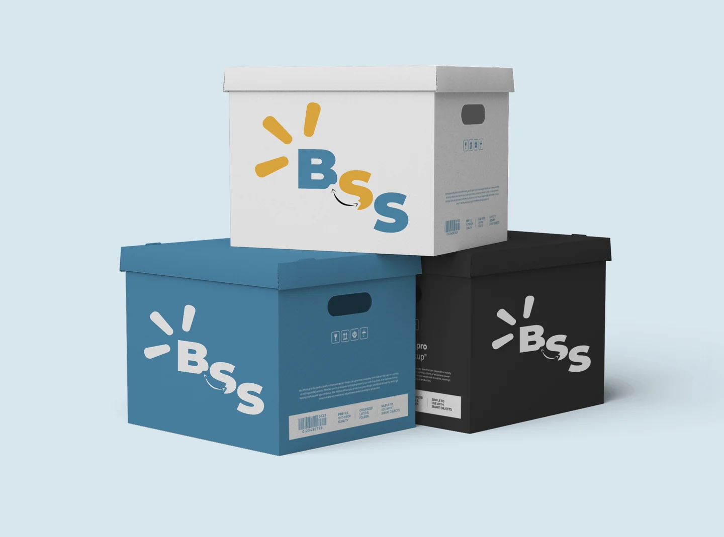
The full logo uses blue and yellow to give the company name a clear focal point. The design archive also shows a compact BSS treatment on packaging. The full wordmark spells out the brand, while the shorter mark occupies less space on a box face.
The two presentations make scale visible. On the kraft mailer mockup, the full name can be read across a wide surface. The archived packaging exploration shows the compact treatment across white, blue, and black boxes.
Create the logo and explore practical applications
The project produced the custom logo. The archive also retains business card artwork and branded mockups. The packaging images on this page show design applications of the identity.