A contractor website should help a suitable customer make a confident next move. They need to understand the work you do, whether you serve their location, what evidence supports your claims and what will happen if they contact you.
That sounds straightforward until the website becomes a collection of competing priorities. A dramatic opening video hides the service description. The project gallery has beautiful photos but no explanation. The estimate form asks for a complete specification before anyone has spoken to the customer. The submission reaches an inbox that nobody checks consistently.
Good contractor website design connects those parts. It makes the business understandable and the inquiry path dependable. This guide gives owners a practical way to inspect that path, plan improvements and evaluate a redesign without relying on promises about conversion rates.
Define the request your website should generate
Start by describing the ideal next step for each important service. A repair business might want a call to assess availability. A remodeling contractor might need a short project inquiry before scheduling a consultation. A commercial contractor may require plans or a procurement contact.
Do not force every service into the same call to action. “Request an estimate” means different things across trades and project sizes.
Write down what the website can honestly offer at the first interaction. Is it an initial conversation, a site-visit request, a preliminary assessment or a confirmed appointment? Does the customer receive a price immediately, or does the team need to inspect the project?
Keep the button language and the underlying process aligned. A button labeled “Get an instant quote” should not lead to a form that merely promises a future callback. A scheduling screen should not imply a confirmed installation when it only reserves an introductory call.
A useful definition might be: “The site should generate enough information for our coordinator to confirm service and location fit, then arrange the appropriate estimating step.” That definition gives designers, developers and office staff a shared goal.
It also helps you evaluate results. More forms are not necessarily an improvement if the additional requests are outside your service area or cannot be handled by the team.
Answer the first four questions clearly
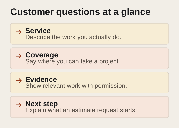
A prospective customer arriving on a service page should not have to solve a puzzle. The page needs to answer four questions:
- What work do you do?
- Where do you do it?
- Why should I consider this company?
- What should I do next?
The opening section does not need to contain every detail. It needs enough clarity for the visitor to decide whether continuing makes sense.
A vague headline such as “Building dreams with excellence” tells the reader little. A specific headline describing the service and relevant area is easier to understand. Supporting copy can explain the type of work, the process and an important distinction.
Use truthful, useful details. If you work primarily on occupied homes, explain how the planning process addresses that situation. If the company focuses on commercial tenant improvements, say so before residential customers spend time completing a form.
Avoid unsupported superlatives. “The best contractor in the region” is not a substitute for evidence. A clear description of relevant work and a verifiable project example usually provides more substance.
Ask someone unfamiliar with the company to review the first screen. Can they describe what you do and who it is for? If they repeat the slogan but cannot explain the service, the opening needs work.
Organize services around customer decisions
A long list of services can be difficult to navigate when the labels reflect internal departments rather than customer needs.
Group services in a way a prospective customer can understand. Use recognizable names and explain specialized terms. If a service has several distinct project types, help people choose the relevant path.
For example, a roofing business may need to distinguish repair, replacement and a particular commercial system. A general contractor may need separate pages for additions, kitchens and whole-home renovations because the buying questions differ.
Create dedicated pages when the service has enough distinct information to justify them. A page should explain scope, project fit, process, proof and the next step. Avoid splitting nearly identical material into many thin pages simply to repeat search phrases.
Keep navigation practical. A visitor should be able to reach important services without opening several nested menus. On mobile, long menus and vague labels can make the site harder to use even when the desktop version looks tidy.
Review the relationship between service pages and the homepage. The homepage introduces the company and directs visitors. Service pages carry the more specific conversation. An advertisement or search result may bring someone directly to a service page, so that page must make sense without a prior visit to the homepage.
Explain service areas without creating false expectations
State where the business routinely works and how to check a boundary case. Use recognizable locations rather than relying only on a decorative map.
If different services have different coverage, explain the distinction. A company might travel farther for a large scheduled project than for a small repair. The website should reflect that operational reality.
Avoid lists of places where you do not genuinely provide service. A larger location list can create more confusion for customers and more work for the office.
Location pages need useful content, not only a swapped city name. Relevant project examples, accurate service availability and practical process information can help. Invented local offices or unsupported claims of neighborhood experience cannot.
Include project location early in the inquiry process when it affects fit. A city or postal code may be enough for an initial check. Request a full address when the next step genuinely needs it.
Make the edge-case path clear: “Tell us the project location and scope, and we will confirm whether we can help” is more honest than an unconditional promise to serve an entire region. Use wording that your team has approved and can follow consistently.
Use evidence that answers a real concern
Customers evaluating a contractor are often trying to reduce uncertainty. Can the company handle this kind of work? Does the team communicate clearly? What does the finished work look like? How is the project managed?
Choose evidence that answers those questions.
A project gallery can show relevant workmanship, but captions provide context. Explain the original need, the scope performed and any meaningful constraints. Separate what your team did from work completed by others.
Use testimonials accurately and with permission where required. Do not rewrite a customer's statement so it claims a result they did not describe. Avoid presenting an old review as evidence of a current service the business no longer offers.
Credentials should be specific, current and appropriate to the jurisdiction. Verify applicable advertising requirements before displaying license numbers, certifications or insurance-related claims. Do not add a generic “licensed, bonded and insured” badge without checking both its truth and whether that wording is permitted.
Show the real team when appropriate and approved. A named person with a clear role can make the process easier to understand. Do not use stock or generated people as though they are employees or customers.
Proof does not have to be dramatic. A clear explanation of how estimates are prepared, how changes are documented and who communicates with the customer can demonstrate care without inventing business results.
Make project examples useful on their own
A project page should tell a small, complete story. It should not require the reader to infer everything from photographs.
Start with the project type and general location when disclosure is approved. Explain what the customer needed and the part your business was responsible for. Describe relevant constraints without revealing unnecessary personal information.
Then show the work in a sequence that makes sense. Before-and-after images can be helpful when they are authentic, comparable and accurately labeled. A close-up may show a detail that a wide shot misses.
Keep claims modest. A photo can show a completed installation; it does not prove increased property value or long-term performance. Only state measured outcomes when you have a reliable source, scope and time period.
Add a connection to the next step. If a reader is considering a similar project, explain which service page or inquiry path to use.
Consider an illustrative project-page structure:
- Project type and approved general location.
- Customer goal.
- Scope performed by the company.
- Constraints and decisions.
- Labeled images.
- Verified outcome or completion description.
- Relevant service link.
- Clear inquiry action.
This structure is a content template, not a case study. Fill it with real evidence before publishing. If approvals are missing, use an explicitly illustrative diagram rather than a fabricated customer story.
Choose calls to action that match readiness
Some visitors are ready to contact you. Others need to understand the process or see relevant work first. The page can support both without presenting a wall of equally prominent buttons.
Choose one primary action for each section. Use secondary links where they answer a different question, such as viewing project examples or reading the estimating process.
Two useful patterns are:
For a straightforward service request: “Request an estimate” with a short explanation of the information needed and what happens next.
For a complex project: “Discuss your project” with a description of the initial conversation and any preparation that would help.
These are illustrative patterns. The correct wording depends on the business's actual process. Avoid promising free estimates, immediate availability or a fixed turnaround unless those details are verified.
Repeat the main action at sensible points, especially after the reader has seen useful information. Repetition should make the action convenient, not interrupt the content.
Check button destinations. A label can be excellent while the link opens the wrong form or an outdated scheduling tool. Test the full path rather than reviewing the visual design alone.
Design the estimate form around the next decision

The form should collect enough information to move the request forward. It does not need to perform the entire sales conversation.
Begin with the questions the office truly uses: contact details, project location, service type and a brief description. Add fields only when they change the next action.
For every field, ask three questions. Why do we need this now? Who uses it? What happens if the customer does not know the answer?
If nobody can explain a field's purpose, consider removing it. If the information is useful later, collect it during the conversation instead.
Optional photos can help with preliminary understanding. Explain file types, size limits and the purpose of the upload. Do not make the form depend on photos when a customer may not have them available.
Budget questions require care. If a range helps route projects, explain that purpose and provide sensible options. Do not imply that the customer must know the final cost before requesting professional guidance.
Keep required fields distinguishable and instructions clear. The W3C's form guidance explains the importance of labels associated with controls and instructions that help people complete forms. Placeholder text alone should not carry essential labeling. W3C WAI: labeling form controls
A shorter form is not automatically better. A form that removes all qualification may increase unsuitable requests. The right balance depends on whether each question helps the customer and the business reach a useful next step.
Treat confirmation and error states as part of the design
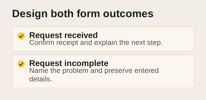
The website's job continues after someone presses the button. A customer needs to know whether the request succeeded and what happens next.
Use a clear success message. If an acknowledgment email is part of the process, explain that without implying a human has already reviewed the project. State response expectations that match actual staffing.
A submission is not automatically a booked appointment or accepted project. Make those distinctions visible when they matter.
Error messages should identify the problem and explain how to fix it. “Something went wrong” gives the user little direction. “Please enter a valid email address so we can reply” is more helpful when that is the actual issue.
Preserve information when possible so the customer does not have to start over. Ensure errors are available to people using assistive technology, not only indicated by a red outline.
W3C guidance recommends concise, clear notifications and error messages that help users identify and resolve mistakes. Successful completion also needs to be communicated accessibly. W3C WAI: form notifications
Test both success and failure. A polished form that works only under ideal conditions is not a complete inquiry path.
Make mobile contact genuinely usable
Review the website on a real phone, not only a resized desktop window. Tap the menu, follow the service links and complete the form.
Check whether the phone number is easy to find and whether tapping it opens the expected calling action. Make sure a sticky contact bar does not cover instructions, consent controls or the submit button.
Look for fields that trigger an awkward keyboard, dropdowns with tiny targets and upload controls that are difficult to use. Test with the device orientation and text settings a customer might choose.
Do not hide essential service information on mobile to make the page look shorter. The customer still needs scope, coverage and process details.
Avoid stacking interruptions. A cookie notice, chat bubble, promotional popup and sticky header can leave little usable space. Each feature may seem reasonable alone while the combination obstructs the task.
Test the page under less-than-ideal conditions. Large images, video backgrounds and third-party widgets can behave differently on a slower connection. If the main content is delayed or buttons shift while someone tries to tap, the design needs attention.
A mobile-first wireframe can keep priorities clear: service and location, one primary action, relevant proof, process, concise form and a visible confirmation. The final layout should follow the content rather than forcing the content into a decorative template.
Include accessibility from the beginning
Accessibility is part of making the website usable. It should not be reduced to an icon added after launch.
People may navigate with a keyboard, use a screen reader, increase text size or need clear contrast and predictable controls. Your inquiry path should work across those conditions.
Check whether interactive elements can be reached and used without a mouse. Make sure focus is visible and follows a sensible order. Use descriptive link text so the destination makes sense.
Write headings that describe their sections. Use meaningful labels and avoid relying only on color to communicate required fields or errors.
Provide useful text alternatives for informative images. Decorative images should not create unnecessary noise for screen-reader users. Complex diagrams may need a nearby text explanation in addition to a short alternative.
W3C's preliminary accessibility checks cover areas such as headings, contrast, keyboard focus, forms and text alternatives. They are a starting point, not a complete accessibility evaluation or a guarantee of legal compliance. W3C WAI: easy checks
For a serious redesign, include accessibility requirements in the scope and acceptance tests. Ask who will evaluate them, which pages and interactions are covered, and how issues will be corrected.
Use performance measurements to find problems
Speed matters to the experience, but a single score does not explain everything. Inspect what the customer actually encounters.
Core Web Vitals measure loading, responsiveness and visual stability through Largest Contentful Paint, Interaction to Next Paint and Cumulative Layout Shift. Google's web.dev guidance distinguishes real-user measurement from diagnostic tools and evaluates recommended thresholds across the distribution of visits. web.dev: Web Vitals
Use those measurements to identify problems, not to promise that a particular score will generate more jobs. A fast page with confusing copy can still fail to help a customer.
Common practical issues include oversized hero images, unnecessary scripts, autoplay media and layout shifts caused by content loading late. Ask the developer to explain the cause and the proposed fix.
Review real-user data when available and use lab tests for diagnosis. Small sites may not have enough field data for every page. Lack of data is not proof of good or poor performance.
Protect the main task when adding features. A chat tool, review widget or animation should earn its place by helping the customer. If a feature slows or obstructs the inquiry path, reconsider its implementation or remove it.
Connect the form to a responsible person
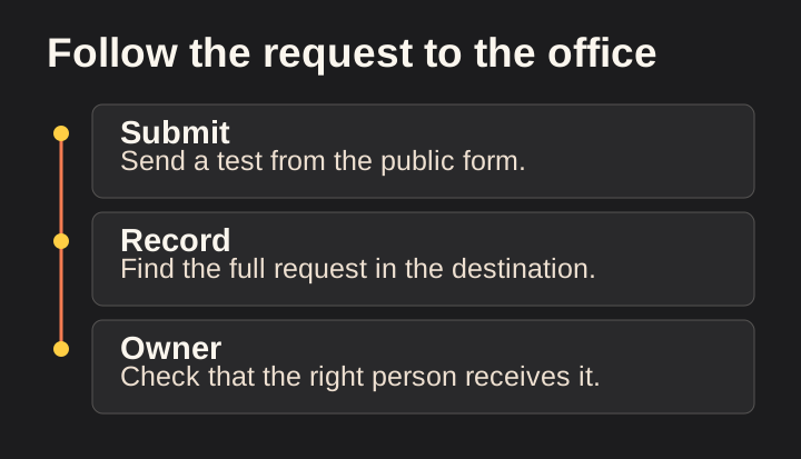
An estimate-request form is only the visible beginning of an operational process. The request must be stored, routed, noticed and acted on.
Identify the primary owner and a backup. Decide what happens outside business hours and when the primary person is unavailable.
Keep one reliable record of the inquiry. Email notifications are useful, but relying only on an individual's inbox can make follow-up difficult to track. Use a system appropriate to the business, whether that is a well-managed shared process or a customer relationship management platform.
Test the actual notification. Does it contain the service, location and contact details needed for the next step? Is the subject line recognizable? Can the responsible person access it securely?
Create a fallback for failures. If an integration stops working, how will the team know? If a notification is filtered, where can the original record be found?
Avoid collecting sensitive information that the estimate process does not require. Review access and retention practices, especially for uploaded plans or photos that may reveal private details.
Automation can acknowledge receipt and assign tasks, but it should not make unsupported promises. A message should not claim a project has been reviewed, approved or scheduled unless that action actually occurred.
Measure useful actions rather than decorative activity
Decide what success means before adding tracking. A page view, button click, form submission and qualified estimate request are different events.
Track them separately when feasible. A phone-number click does not prove a call connected. A form-submit event does not prove the office received a usable inquiry. A request does not prove the project became a customer.
Keep spam and duplicates out of the business outcome count. If one person submits twice because they did not see a confirmation, that is one opportunity and a possible usability problem.
Segment the analysis where it helps: service page, device type, traffic source and genuine qualification outcome. Avoid breaking small datasets into so many groups that every percentage becomes unstable.
Use a clearly labeled hypothetical example to understand the distinction. Suppose a page receives 200 visits and ten form submissions. Four are spam, two are duplicates of existing requests and four are new genuine inquiries. Reporting a five-percent form submission rate may be technically consistent with the event data, but it does not describe the number of new opportunities.
Define the denominator and the event before comparing periods. Changes in traffic mix, season and service availability can affect results even when the page has not changed.
Improve search visibility without making the page awkward
Use the language of the service naturally in the page title, main heading and content. Add related terms when they help explain the work.
Do not repeat a phrase simply to reach a keyword target. Customers need a clear answer, and search engines need an understandable page.
Write descriptive title and summary text that accurately reflect the page. Keep important content available in normal page structure rather than burying every detail in an image.
Use descriptive links between related service and project pages. A project example can link to the service it demonstrates. A service page can point to a useful process explanation or a relevant inquiry path.
For images, use descriptive filenames and meaningful alternative text where appropriate. Google's image guidance emphasizes context, useful alt text and avoiding keyword stuffing. Google Search Central: image best practices
Keep the page's main purpose clear. A service page helps someone evaluate and request a service. A blog article may answer a broader question. Combining every possible keyword and purpose into one page can make it harder to use.
Use a practical acceptance checklist
Before approving a redesign or a major update, walk through the same tasks a customer and office coordinator will perform.
| Check | Evidence to retain |
|---|---|
| Service is clear | Reviewer can explain the offer without assistance |
| Coverage is accurate | Operations owner approves the locations and conditions |
| Claims are supported | Source or approval exists for each material claim |
| Project images are authorized | Rights and customer permissions are recorded |
| Phone path works | Test from a real mobile device |
| Form submits successfully | Saved record and notification are confirmed |
| Error handling works | Invalid and missing inputs produce useful feedback |
| Accessibility is reviewed | Manual checks and issue resolutions are documented |
| Mobile layout is usable | No obstruction of key content or controls |
| Tracking distinguishes events | Test events match the intended definitions |
| Intake has ownership | Primary owner and backup know the workflow |
| Recovery is possible | Failure reporting and access are documented |
This is an acceptance framework, not a certification. Add the requirements specific to your business, technology and jurisdiction.
Assign each unresolved issue an owner. “Needs attention” is not a resolution plan. State what must change and how the fix will be checked.
Prioritize improvements before committing to a rebuild
A full redesign is not always the first useful step. If the form is broken, repair it. If the service area is unclear, correct the wording. If the main offer is buried, improve the opening.
Group issues by impact and effort. Start with failures that prevent a legitimate inquiry or create a false expectation. Then address clarity, proof and usability.
Keep a record of changes so you can interpret later results. If you replace the entire website and launch a new campaign simultaneously, separating their effects will be difficult.
A rebuild may be appropriate when the structure, technology or content cannot support the business reliably. Ask the proposed partner to explain why targeted improvements are insufficient.
Make ownership part of the decision. Clarify who controls the domain, content, analytics, forms and integrations. A website that looks better but leaves the business unable to maintain or access its systems creates a different problem.
Frequently asked questions
What should a contractor website include?
At minimum, clear services, accurate coverage, credible evidence, an understandable process and a dependable contact path. The details should match the way the company sells and delivers work.
How long should an estimate form be?
Long enough to support the next decision, with no unnecessary questions. Test whether each field helps qualification or routing. Complex details can often wait for a conversation.
Will a redesign increase estimate requests?
It may improve the path, but the result depends on traffic quality, demand, offer, credibility and follow-up. Ask for measurable acceptance criteria and honest reporting rather than a guaranteed increase.
Should I use stock or generated project images?
Do not present them as your completed work. Illustrative images can explain a process when labeled clearly, but real project evidence requires authentic material and appropriate rights.
Make the whole request path dependable
A good contractor website helps the right person understand your business and take the next step. The design, content, form and follow-up process should support the same promise.
Start by testing one service page from first visit through office receipt. Note every unclear instruction, unsupported claim and broken handoff. Fix the most consequential issue first.
If you want another set of eyes on that path, request a website review from Loskutech. The useful question is simple: can a suitable customer understand the offer, make a request and reach the person responsible for helping them?
Explore our website and customer-experience services for the work and review process behind this approach.